The Challenge:
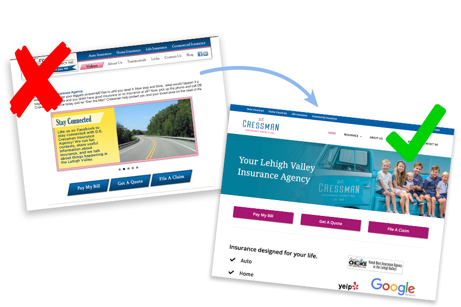
D.E. Cressman Insurance Agency had an outdated website with a dedicated mobile site. This made updating the site cumbersome since there was content for the mobile site and different content for the desktop site.
The Solution:
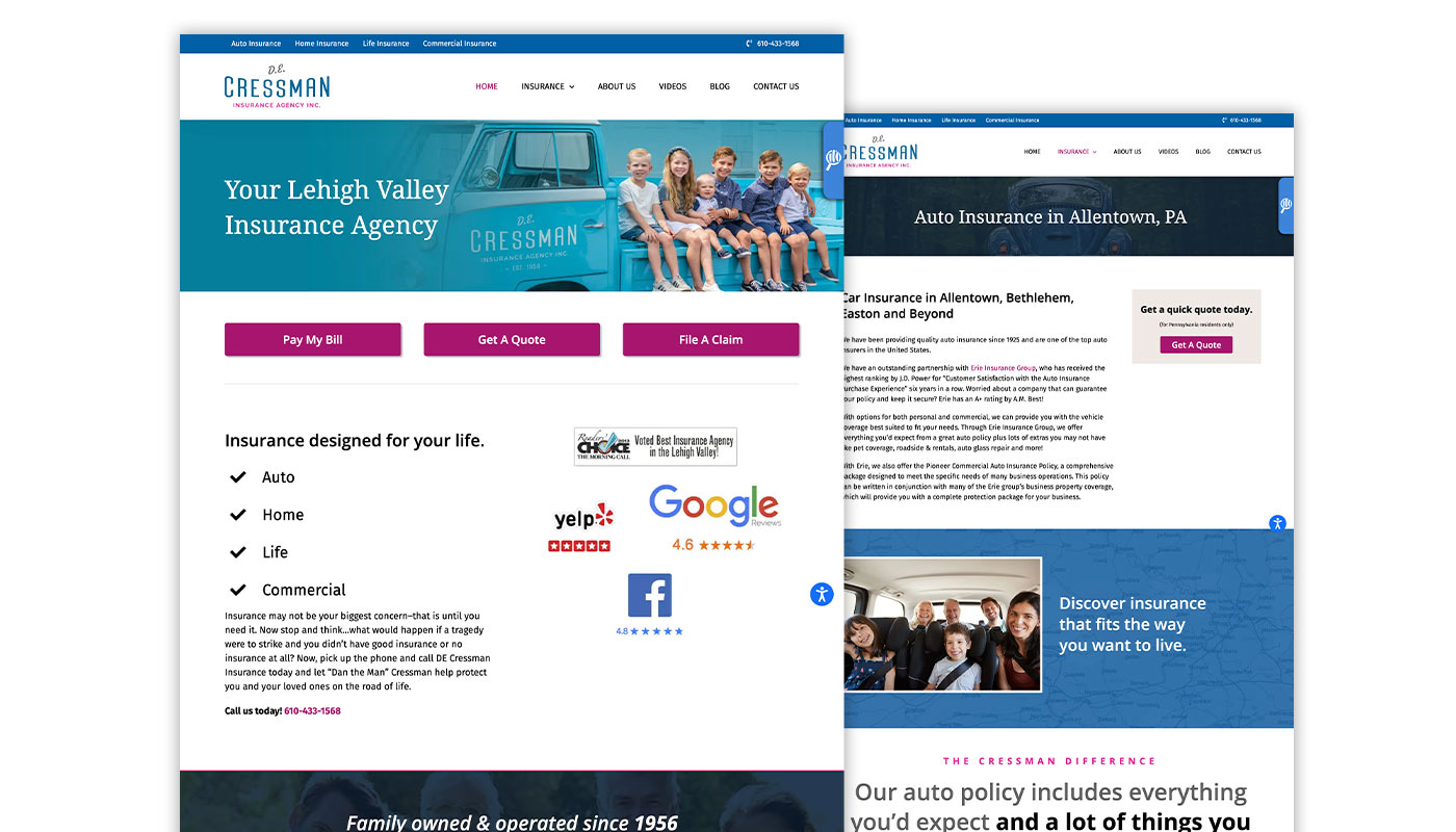
We kept what was working with the original site, increased usability and provided a stronger call-to-action across the site. The Cressman brand is about family and customer service. We didn’t want to lose this on the new site and was sure to keep the same look & feel except with a modern wrapper. The new website is responsive, meaning one set of content to manage and it looks great on all screen sizes.
CLIENT
D.E. Cressman Insurance Agency Inc.
SCOPE OF WORK
Web Design & Development
Marketing
Search Engine Optimization
WEBSITE URL
Website Design + Development
The website needed to look great but also be optimized for search engines, bring in leads, and function flawlessly across all screen sizes.
Marketing
Improving an already strong website is often more complex than fixing one that’s struggling to rank. That was the challenge with Cressman Insurance — their site was already appearing on page one for several top keywords, but there was untapped potential in a few lower-performing terms. After a targeted SEO optimization effort, we boosted their organic search visibility by 42% in just three months, elevating their remaining keywords to page one of Google’s organic results.
